Having an advertising strategy in place is a
must for all brands if they want their target audiences to purchase their products and services. But, it’s also vital that the strategy includes a new and different take on how to advertise to consumers.
Why, you ask? Simply because there are so
many brands out there doing exactly what you are doing, so you need to be able to
stand out.
Every once in a while, we all come across an advertisement that blows us away, and brands should most definitely take inspiration from them.
So, here’s a look at three brands that are acing it at advertising:
1. Boxed Water
Boxed Water is an American company that focuses on providing
the purest water in the most sustainable way possible. They released this product because they were ‘not satisfied with the status quo - [and say that] our planet doesn’t need more plastic bottles.” So, instead of complaining about the issue, it started working towards a solution with unique packaging.
Consumers are so used to seeing water packaged in plastic bottles, which is why it’s so refreshing to see water in,
well, something that isn’t the norm. A huge benefit to this is that it is so much better for the environment as well.
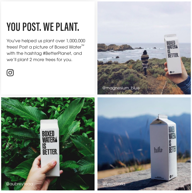 *Image sources from Boxed WaterWhy does this type of packaging work?
 Not only is this manner of containing water totally unique, but it’s also much better for our environment; and we all know that being environmentally and socially conscious is all the rage. Thus, your brand can look into making use of packing that is out of the ordinary as well as being good for the environment, because tickings these boxes is vital for success.
2. Milgrad milk boxes
Bryansk Dairy Plant, based in Russia, was looking to redesign its Milgrad milk line, when the brand came across the talented Vera Zvereva —
a Russian designer and art director at Depot.
Zvereva did a stunning job in creating packaging that is not only eye-catching but engaging, too. Her design included putting a cat on the milk boxes and regardless of how the boxes are moved or pack they will display a little bit of the cat. The cat will either stare at you or play with a ribbon making it very engaging for the consumer.
Depot described the new packing saying that “the blue cat travels through the package – he looks at the consumer with interest, plays with a string, looks out or freezes in anticipation.”
The packaging really helped this product come to life with a cat that came to represent the Milgrad brand, something that all brands can learn from when designing their own products.
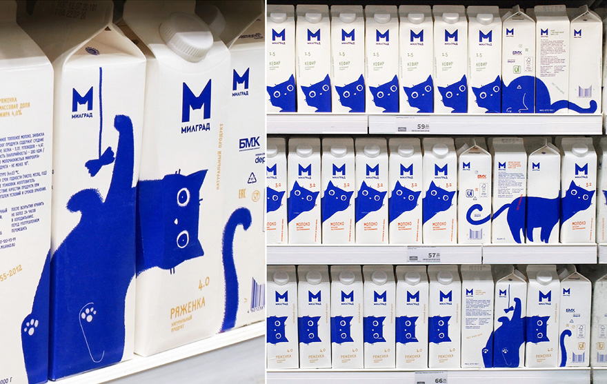 *Image source: Vera ZverevaWhy does this type of packing work?
 The design of the milk cartons are playful and fun, as the consumer sees the little cat staring at them or playing, which provides a sense of happiness and evokes the “
awh ...” response.
This product really did a great job at incorporating the ‘cute factor’, which definitely sells. It is likely that people will buy a few more milk cartons just to rebuild the image at home.
The company also rebranded the entire Milgrad line of products to have the blue cat curiously and playfully staring at consumers. So, what can other agencies learn from this brand? Let’s just say, it might be time to include a brand character for your agency, so that you can enhance your ads and draw the attention of your consumers.
Also, including
a brand character is great for advertising because:
- it enhances the brand expressions: For example, adding to the brand voice and tone that the brand wants to portray to the public.
- it helps build the brand guidelines: This is because a brand character stands for certain values encouraging the brand to stick to those values
- it helps to create brand awareness: It does this by making sure that people associate something with your brand, and a brand character is a great way to ensure that they do that and that it is done in a positive light.
- it helps build an emotional connection with your target audience: This is because they can relate to your brand character or appreciate what it stands for, allowing them to make an emotional connection with your brand and brand character.
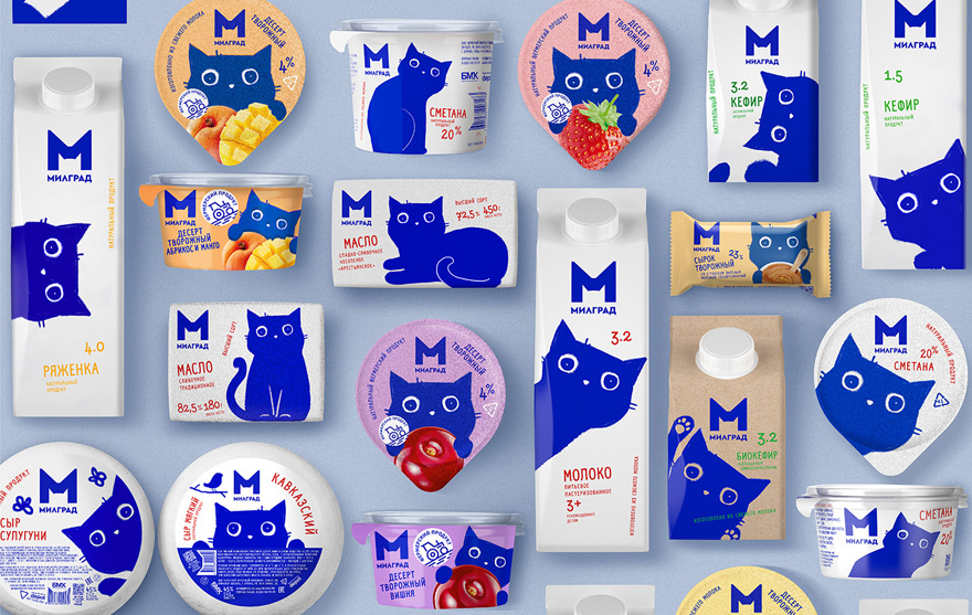 *Image source: Vera Zvereva
3. Frontline Flea & Tick Spray
Perwanal Saatchi & Saatchi in Jakarta, Indonesia took advertising to the next level when it added a huge sticker on the floor to showcase a new Frontline Flea & Tick Spray where the ‘ticks’ and ‘fleas’ are represented by the humans walking over the sticker.
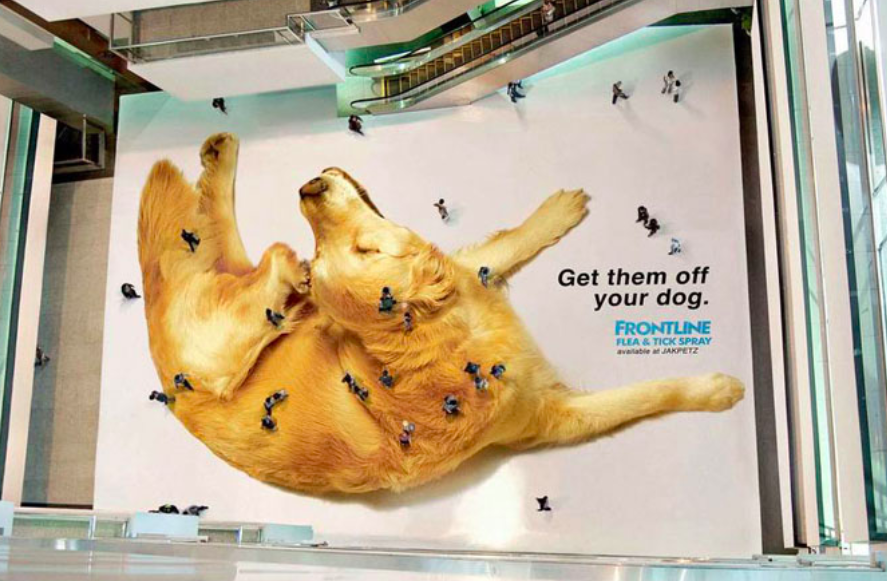 *Image source: The Cool Hunter Why does this type of advertising work?
 The ad itself is really hard to miss, and depending on the number of people walking over it, the sticker creates this visual image of pesky fleas irritating the dog. It could be one or it could be a 100 fleas on your pup, and that is definitely a powerful message for pet owners.
Your brand could also consider going big with its advertisements by making a statement just like Frontline did here. For example, think of a way where you could advertise your product or service on a big scale, like on an elevator door or in a parking lot. You could even get creative with a billboard, like Berger did to show people how its paint is so natural that it blends in with the sky.

*Image source:
Ads of the WorldWhat are some other ads and packaging that you’ve seen and loved? Let us know in the comments section below.
That was exciting, wasn’t it? To get more insightful stories delivered straight to your inbox, sign up for our newsletter.
*Image courtesy of Pexels