Getting people to
actually read your content is one of the biggest tasks for today’s content creators.
People are busy, and hardly anyone has the time to read through an entire article. So, what can be done?
media update’s Aisling McCarthy explains seven of the ways to make your content more skimmable — and thus, more likely to actually be read.
What is ‘skimming’?
Skimming is the process of quickly scanning through content, only reading the main ideas within a passage to get an overall impression of it.
Skimming usually involves the following steps:
- Read the title
- Read the introduction
- Read the first sentence of every other paragraph
- Read any headings and subheadings
- Take note of any pictures, charts or graphs
- Note any italicised or bold words or phrases
- Read the conclusion
Why is skimming the new norm?
According to an article in
The Guardian by Maryanne Wolf,
the digital era has greatly affected our ability to process information. Because the digital medium requires us to process large amounts of information at high speed, our ability to process slowly is actually diminished.
We are constantly bombarded by information, regardless of where we are. Online, there are hundreds of pop-up ads, flashing images and endless emails; while in the real world, every person is glued to their cellphones, unable to ever
really do anything in peace.
We are living in an age where attention is more divided than ever — and
that’s exactly where skimming comes in.
As people race to finish their daily tasks, they only have a few moments to allocate to reading content —
no matter how well written it is.
How do we beat the skim effect?
While there will always be a place for long-form, in-depth writing and analysis, it’s important to understand that if you’re writing for the average person — they’ll be skimming your content, so why not take advantage of that?
Write content that lends itself to being skimmed.
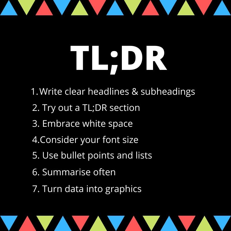
1. Write clear headlines and subheadings
Your headline and subheadings need to clearly guide your readers. Make sure they sum up exactly what your content is about and clearly explain what the content covers. You want to make it easy for your readers to get a sense of what your content is about without having to read too much.
2. Try out a TL;DR section
If your readers don’t have time to read all of your content, why not offer them a compressed version with the major facts? Including a ‘Too Long; Didn’t Read’ section allows readers to skim your content and decide if they want to read more.
3. Embrace white space
Increased white space has been trending over the past few years — and it’s no coincidence that it’s linked to the rise of skimming.
Cluttered content makes reading and interacting with it more difficult. And that makes people not want to read any further.
Breaking your content down into bite-size paragraphs makes it look far more manageable, and thus, far more appealing.
4. Consider your font size
Font size goes hand in hand with whitespace — it’s all about readability.
According to an article by Ryan Bozeman,
the best font sizes are between 18 and 22 — depending on the design of your webpage.
“Your content should be easy to read without taking up too much space on the screen, [and] don’t forget [about] mobile users. There has been a consistent increase in average font size in recent years and for good reason — bigger text improves comprehension,” he writes.
5. Use bullet points and lists
Where possible, break your content down into bullet points or a list. These types of content lend themselves to being skimmed, easily allowing readers to quickly digest the main points with minimal effort.
Bulleted lists are especially useful for actionable content; breaking the process down into a series of steps makes it far easier to understand.
6. Summarise often
There are natural places where readers look for summaries in content. Generally, the first and the last sentence of each major section should serve as an introduction and conclusion — giving readers an idea of what the content covers.
Structuring your main sections in this way allows readers to skim through your content all the way to the end without getting bored and clicking away.
7. Turn data into graphics
Rather than listing statistics, why not turn that data into graphs and visuals? Graphics will naturally draw a reader’s eye, so why not use that to your advantage? As the saying goes, ‘a picture is worth a thousand words’ — so utilise them to get your message across quickly.
What other strategies can content creators use to make their content more skimmable? Share your thoughts with us in the comments section below.
Well, hello there. Since you didn’t skim past this line, why not subscribe to our newsletter while you’re here?
Since skimming is at an all time high, print media is becoming more of a luxury good. Find out more in our article, Print versus digital: Print becomes premium.
*Image courtesy of Vecteezy