media update’s Talisa Jansen van Rensburg takes a look at how typography influences your content and how to ensure that you make use of the correct formats.
Typography is much more than just the fonts you choose. There is a lot of thought that
should go into how you want to display your content online, and if you put out an article with the incorrect typography, it could affect the way people read your blogs immensely.
First things first: What
is typography?
“
In essence, typography is the art of arranging letters and text in a way that makes the copy legible, clear, and visually appealing to the reader,” says Jaye Hannah, contributor at Career Foundry.
Typography is essentially what brings your content to life; it evokes specific emotions from your readers and ensures that the correct message is being sent when they’re reading your content.
With that said, here are four ways that typography affects your content:
1. Typography can change the meaning of the text
When you write something with an intended message, typography plays an essential role in making sure that the message is not interrupted by the wrong type of font.
Take a look at the following image: How does each font affect the meaning of the message being sent out?
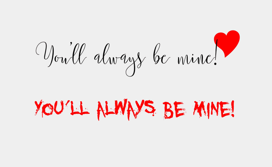 Image sourced from Plexable
The top font sends a clear message of romance and could potentially be used for a Valentine’s card. But let’s say that is not the intention of your messaging. What would you need to change?
Simple: the font.
In the bottom font, the message you receive is completely different. Although it uses the same words, the font makes it seem as if blood has been splattered across the page, which gives it more of an ‘edge’ or ‘horror-like’ feel.
It is clear that different types of fonts can change, or disrupt, the meaning of your content. It’s up to you to decide what the meaning of your content is, which is something that should be decided on before you decide what font to use.
2. Typography evokes emotions
“
Good typography induces a good mood,” says Dr Kevin Larson from Microsoft Advanced Reading Technologies.
Different fonts and different spacing will play a big part in how the reader reads the message, and how it makes them feel.
For example, you will probably read these same words differently in your head:
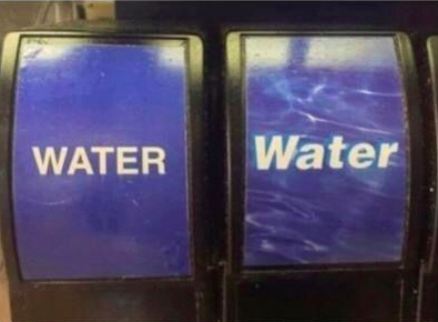
The water on the right side makes you feel calm, like the ocean in Fiji as opposed to the water on the left side that makes you feel dull, like the water in the tap.
Here is a breakdown as to what fonts work best for what emotion:
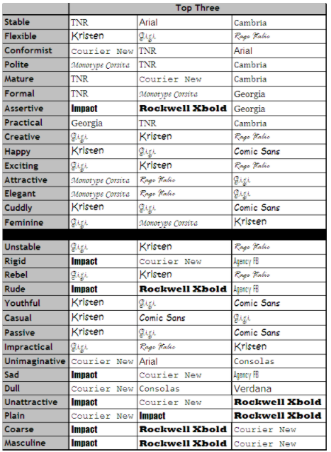 Image sourced from Usability News
3. It holds the reader’s attention
No matter how compelling or interesting your content is, if the typography does not complement the content, then it will not be read in the way that you intended. For example, if you want your content to be taken seriously, you probably shouldn’t make use of Comic Sans.
Another important aspect of typography to take note of is white space. It is important to ensure that you have a balanced amount of white space to make it easier for your audience to read your content. Easy content = more readers.
For example:
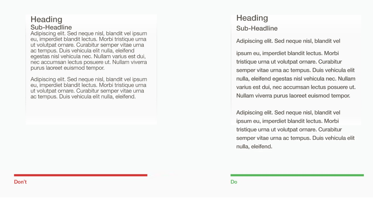 Image Sourced from Uxplanet
The right side reads a lot easier and readers will be able to follow the content more fluently as opposed to the left side. A big role of typography here is the fact that the right side contains white space (the space in between words and paragraphs).
According to Prototypr.io, the following benefits will come from using white space correctly:
- Improved comprehension
- Focus and attention
- Increased interaction rate
- Guide the user through logical grouping
- Creates a breathing space for users
Another important factor that typography plays is setting out the
hierarchy. If the content is just plastered all over the pages without a clear structure, it will become impossible to read.
The size of your font and an indication of lists and headings become vital here. For instance, if you published your content with subheadings smaller than the actual content, it will
seriously confuse your readers.
Imagine a person only wants to skim through your content to see what it is actually about. The hierarchy and structure of the article will give a clear idea of it, without them even having to read the introduction. All they have to do is skim through the headings and bullet points.
4. Improves your content’s message
Back in 2012,
The New York Times conducted an experiment on its readers where in which it “
presented a two-part series designed to test how information is perceived when presented in different typefaces.”
The study found that readers who viewed the passages in Baskerville agreed a lot more to what was being said than those who read the same passages in fonts like Helvetica and Comic Sans.
Therefore, if you want your content to appear trustworthy you want to consider a font such as Baskerville or Serif fonts. If you want your content to be more conversational and engaging you might consider making use of Calibri.
In the following example, you will see how the font represents the ice cream melting. This is a great inspiration for the typography you could use in your content when you want to tell a friendly and happy story, since the font is soft and round.
 Image sources from Prototypr.io
The softness of the typography used in this image represents ice cream melting, suiting the theme of the poster.
It is clear that typography plays a key role in the way your content is being received and read by your audience.
What are some other effects typography can have on content? Let us know in the comments section below.
We see you’ve enjoyed our content right until the end. To get more insightful stories, sign up for our newsletter.
*Image courtesy of
Vecteezy