The saying ‘don’t judge a book by its cover’ is a concept that doesn't apply to social media marketing. Rather, ensuring that your brand’s image is as aesthetically pleasing as possible is of the
utmost importance.
Why? Well, humans are wired to be more responsive to visuals. After all, it only takes
150 milliseconds for a symbol to be processed and 100 milliseconds to attach a meaning to it.
For this reason, if you want a message to resonate with your audience, it needs to be memorable. Your brand will be a lot more
memorable if you not only tell consumers what your message is, but you also
show it to them in a creative way.
Need more proof?
media update’s Taylor Goodman unpacks three reasons why brands need to post uplifting visual content online:
Visual content makes your brand relatable
Using visuals is an effective way to not only make your content more aesthetically pleasing but also more relatable.
As you can incorporate real people into your visual content, this is one of the easiest ways to make your content more authentic.
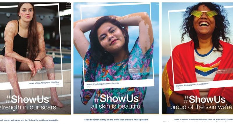
 *Image courtesy of Image
For example, the above Dove ad campaign uses images of real, everyday people.
Showcasing regular people makes this content more relatable as it may help consumers to see themselves in the ad, which may encourage them to purchase from the brand.
Another way you can help your audience relate to your social content is by taking them behind the scenes. Show them your employees, what they do and share your company's values and vision.
This uplifting, visual content will humanise your business in the eyes of the consumer, which will help in building an authentic brand image.
Inspirational content garners high engagement on social media
This is some of the most-shared content on social media. Why? Because positivity is infectious!
Think of a platform like Facebook, for example. When scrolling through your News Feed, it’s never long before you come across a motivational quote or post. This is due to the sharable nature of this inspirational content.
This is because it resonates with these users, and when it strikes a chord with them, they feel more inclined to pass it on to followers.
It is important to note, however, that inspirational content does especially well if it is also visual. As the human brain connects to visual images faster, this will only boost a motivational message.
Still not convinced? Take a look at these
stats on how visuals can increase social media engagement:
- Tweets with images receive 150% more retweets than those without images.
- Facebook posts that have images see 2.3 times more engagement than those without.
- Colourful visuals increase people’s willingness to read content by 80%.
- Attractive content makes the consumer what to buy your product
- How many times have you bought something simply because it looked good? The answer is probably more than you can count!
Attractive content makes the consumer what to buy your product
How many times have you bought something simply because it
looked good? The answer is probably more than you can count!
This is because visuals are what first attracts customers to a product, a social media page or an ad campaign. For this reason, it is of the utmost importance that brands ensure they are putting out
aesthetically pleasing content.
Pizza Hut is a perfect example of how to use visual content to encourage consumers to purchase a product. The brand keeps it simple and posts a lot of short video clips and images of delicious pizza.
Anyone hungry? However, because consumers are inundated with content, you need to use visuals that sets your brand apart from the rest.
Think: What makes Pizza Hut’s pizzas more visually pleasing than others? It’s all about what makes you
different. That’s where the true answer to engagement lies.
You can ensure that your content is attractive to consumers by paying specific attention to the following areas:
Typography
Ensure that the fonts you use in your visuals mesh well together. This will make a
major difference in improving the look of your content.
It is also important to use fonts that match your brand’s personality. For example, if you are a make-up and beauty brand, you would want to use a more feminine font, like Pacifico or Caveat. The reason for this is because a font is on the forefront when it comes to brand representation; its style and approach should mirror that of the brand’s.
Colour
When choosing colours for your visuals, they need to match your brand. Similar to typography, the colours you use should reflect your brand’s personality.
Each colour also represents a different mood. For example, green could be linked to money, while yellow is linked to sunshine. Keep this in mind when choosing colours for your visual projects.
It is also best to adopt a ‘less is more’ approach when picking your colour scheme. You want it to be complementary, not overwhelming.
Your message
Although attractive visuals are key, you must not neglect the messaging. You need to ensure that your brand’s message complements its graphics. Doing this will only make your content much more effective.
Put yourself in your consumer’s shoes and ask yourself:
What message is this piece of content conveying? Not only does beautiful content attract consumers, but it also keeps them interested in your brand and helps to build engagement.
What makes a piece of visual content stand out to you? Let us know in the comments section below.
*Image courtesy of Vecteezy